Animations in Flutter - a developer’s guide
Whether you're a beginner or an experienced developer, this guide will provide you with the knowledge & skills you need to create smooth & dynamic animations in your Flutter apps.
Introduction
Animations are an integral part of modern mobile app design, helping to create engaging and interactive user experiences. In Flutter, Google's open-source UI toolkit, developers have access to a rich set of animation tools and APIs that make it easy to bring their apps to life. In this guide, we'll explore the different types of animations available in Flutter, including drawing-based and code-based animations, as well as implicit and explicit animations. We'll also dive into some practical examples of using animations in Flutter, such as creating automated carousels, parallax effects, animated buttons, bouncing views and more! Whether you're a beginner or an experienced developer, this guide will provide you with the knowledge and skills you need to create smooth and dynamic animations in your Flutter apps.
Types of animations
In general, we can distinguish two types of animations:
1. Drawing-based animations and
2. Code-based animations
Drawing-based animations look like someone drew them. In general, they are a little bit complex and it would be really hard to create them by using purely code. These types of animations are often created by third party tools such as Rive or Lottie and then exported to Flutter. In terms of code, by the help of some packages they can be animated very easily by calling the start and calling the stop methods.
Code-based animation can be built out of Flutter widget primitives. They heavily depend on some built-in widgets and most of the cases, you will encounter these types of animations. Code-based animations come in two flavours, implicit animations and explicit animations.
Implicit animations
An implicit animation relies on setting a new value for some of its properties and it will be animated from the former to the latter value. Implicit animation widgets are often created by primitive widgets like Container by simply putting the “Animated” prefix before them. So AnimatedContainer is a basically Container widget that can be animated over time. Implicit animations are a good place to start and they are easy to use.
Explicit animations
Explicit animations are a bit more complex than the implicit ones. They require an animation controller and they are called explicit because they only start animating when explicitly asked to.
In order to create explicit animations, you are going to need an AnimationController and a StatefulWidget where you can manage the lifecycle of the controller. The rule of thumb is that you initialise the controller in the initState() and dispose it in the dispose() lifecycle method of the StatefulWidget.
Explicit animations offer a wider range of possibilities than implicit animations, making them a better choice for creating more complex and dynamic effects. While implicit animations can achieve similar results, explicit animations provide more flexibility and control over the animation process. Of course, there is a tradeoff as in order to get the same results you’ll have to write more code when using explicit animations.
Practical examples and how to execute them
Automated Carousel

In order to create an Automated Carousel first we need a PageController. Every page is represented by a picture and to move between the pages, we need to call the nextPage() function on the controller.
We want our Carousel to swipe in a direction every third second and go around infinitely. To make this happen we need a Timer variable. Then in the initState() method we initialise the _timer variable with the Timer.periodic() factory constructor. The code which resides in between the parentheses will run until our Carousel widget gets destroyed. We set the periodic duration to 3300 milliseconds and invoke the nextPage() function on the _controller so every 3,3 seconds this code runs down.
To show the images on the screen we need a Pageview.builder and assign our _controller to its controller attribute. On its itemBuilder attribute we can show the images in a Container decoration property with the index provider by the itemBuilder. We have to be careful here because remember: we call our _controller’s nextPage method indefinitely which means the index will be ever increasing. This can result in an “out of index” error very easily. We can handle this problem by using modulo(%) which returns the remainder. Index modulo item’s length gives us exactly the interval we need because the remainder can take a value from 0 up to the item’s length -1.
The last part of the Carousel is the indicator at the bottom middle section. This part is being built outside of the PageView so it does not know the actual index. That is why we create the _currentIndex variable. But how do we change this variable when the page changes? This is where the PageView.builder’s onPageChanged attribute comes in. It is being called every time the page changes. We have an _onPageChanged() function which gets the new index as a parameter so we can set the _currentPage to that specific index. As a result, the _currentPage variable changes and because of the StatefulWidget’s setState() method the build() function reruns so we see the changes on the screen.
Parallax effect
The Parallax effect works by making different layers of content move at different speeds when a page is scrolled.
In this example we use a very simple method to achieve this effect. We put our pictures into a PageView.builder widget. Then we create a PageController _controller variable and assign it to the PageView.builder. We set our pictures’ scale to 1.8 and set the fit property to BoxFit.none. This gives us a zoom-like effect on the images. As we scroll the pictures the _controller’s page property changes. We convert this changing value to a pageOffset in order to align our pictures. This technique results in the Parallax effect.
Animated button

In this example, we’ll show you how to create an animated button. As you can see, by clicking the button a download process begins, saving a video from the Internet. We can see the state of the mentioned downloading process in the middle of the button and at the end of it, the button transforms back to its original form.
We can separate this animation into 2 parts. In the first part, we animate the button only and the second part, the contents of the button.
1. In order to animate the dimensions of the button we need to use an AnimatedContainer. With that widget we can easily change the width and the radius of the button as time passes.
2. To animate the contents of the button, we use the AnimatedSwitcher widget. It basically switches the content of its child property and we can add animations to it too.
In the transitionBuilder property we set a scale and a fade Transition to animate the context of the button. By clicking the button, the download process starts and we can see that process value and show it too. It is a task that requires internet connection therefore there is a possibility of failure. When we catch an error we set the hasError variable to true and we show a red button with a refresh indicator.

Bouncing View

In this example, we’ll see how we create a bouncing animation when tapping on a new bottom tab bar item. We can separate this animation into two parts again.
1. The first part is the icon switch. We can accomplish this by using an AnimatedSwitcher widget and switching its child property whenever a new item is tapped.
2. The second part is the bouncing animation. To make the icons bounce we wrap them into a custom widget called BouncingView. This widget uses an explicit animation with an AnimationController and an Animation. In order to use an AnimationController we need to use a mixin called SingleTickProviderStateMixin.
In the AnimationController we set the duration of the animation to 100 milliseconds. Then we initialise a Tween animation. We want the icons to shrink down then transform back to their original scale. With that in mind in the initState() method we set the tween animation begin property to 1 and end property to 0.9. Then we call the animate() function on it with a CurvedAnimation which takes our Animation controller and a curve type.
This would shrink the icon to 90% of its size but we miss the reverse part. In order to reverse the animation we simply call the reverse() function on the Animation controller when the AnimationStatus is completed.
After that we need to put our icon inside an AnimationBuilder together with our animation and we provide a Transform.scale widget in the builder since we want to modify the scale of our object. The last step is to call the forward() method when we tap our icon. Note that you don’t have to care about resizing the animation since the controller itself monitors the animation state and calls reverse when it's completed.
Animated Wave
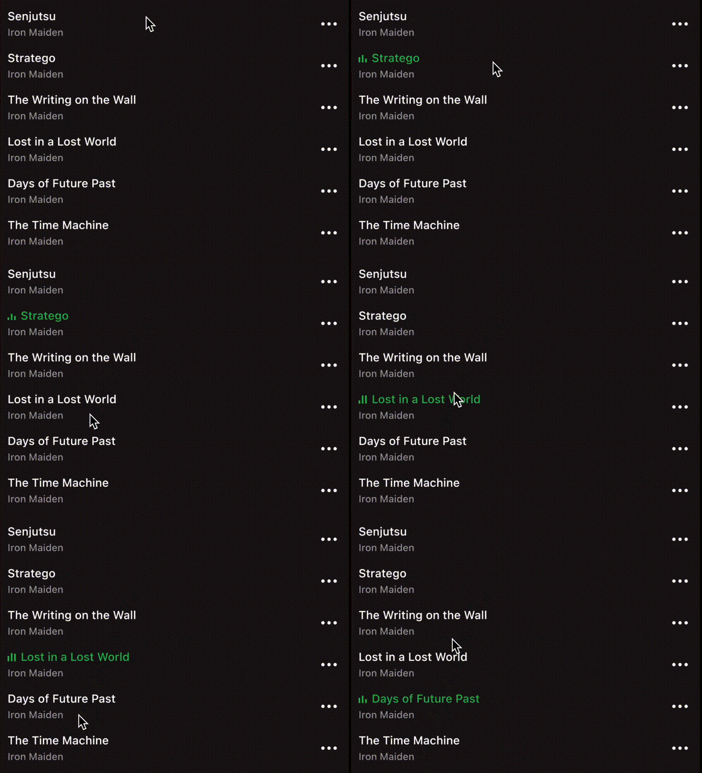
The animated wave is an explicit animation too and we can use an AnimatedBuilder widget to animate the bars. We have three bars and we animate them by using the animation controllers’ value by combining them with the sin() function.
The bars’ width is constant but their heights are changing when a song is playing. We use this formula in case of all the bars but we change some numbers to make it look like they are completely independent.
Instagram Story
The last animation we’ll introduce you to is the copy of the movement of an Instagram story. The user is able to switch between the images or swipe between stories with the power of the cube animation.
On the top we have animation bars and their number corresponds to the number of images in a story. To animate the bars we use an animation controller. Every bar has its own index and we always track the current one. With this information we can either show an empty or an animated bar. When we show an animated bar we stack another bar on top of an empty bar with colour added to it.
We monitor the animation so when it ends we simulate a right tap.
In case of a right tap two things can happen. Either we switch to a new picture within the same story or we run out of pictures and we transition to the next story, if there is one. In case of picture change we simply increase the currentIndex. If we transition to the next story we increase the userStoryIndex, load the user story and animate.
We are also able to stop the animation flow with one tap or long tap likewise in a real Instagram story.
To go back to the previous or forth to the next story we can swipe either to the left or to the right. While swiping the animation bar stops and when the swipe ends the animations start again.
To make this cubic swipe animation happen we use a ValueListenableBuilder on top of our PageView builder.
We pass a ValueNotifier in the valueListenable property of the ValueListenableBuilder. This indicates the extent of how much we swiped our object on the screen. The secret of the cubic animation is the Transform widget. When we swipe our image we use the valueListenable’s value to compose a transformation which we pass into the Transform widget. This makes it look like we rotate an object in 3 dimensions.
Conclusion
Animations are an essential aspect of creating a captivating user experience, and Flutter provides an impressive set of animated widgets to make the process simple and efficient. However, while pre-designed animations can be convenient, sometimes they may not be sufficient for your application's unique needs. This is where explicit animations come in. They offer a way to achieve highly precise and refined results, which can transform your UI into something truly remarkable.
While creating explicit animations may require more time and effort than using pre-designed animations, it can be well worth it in the long run. With Flutter, you can create almost any animation that you imagine. This allows for unparalleled customisation and attention to detail, leading to a truly exceptional user experience. Whether you're crafting a mobile app or a web application, animations can make all the difference in elevating your app to the next level!
We hope that you found this blog post useful! Do not hesitate to follow us, so you won’t miss interesting stories in the future either. This article was provided by Omár Eltigani and Bence Csondor. Melinda Havas, Head of Marketing & Business Development revised the content and formed it into this blog post.


